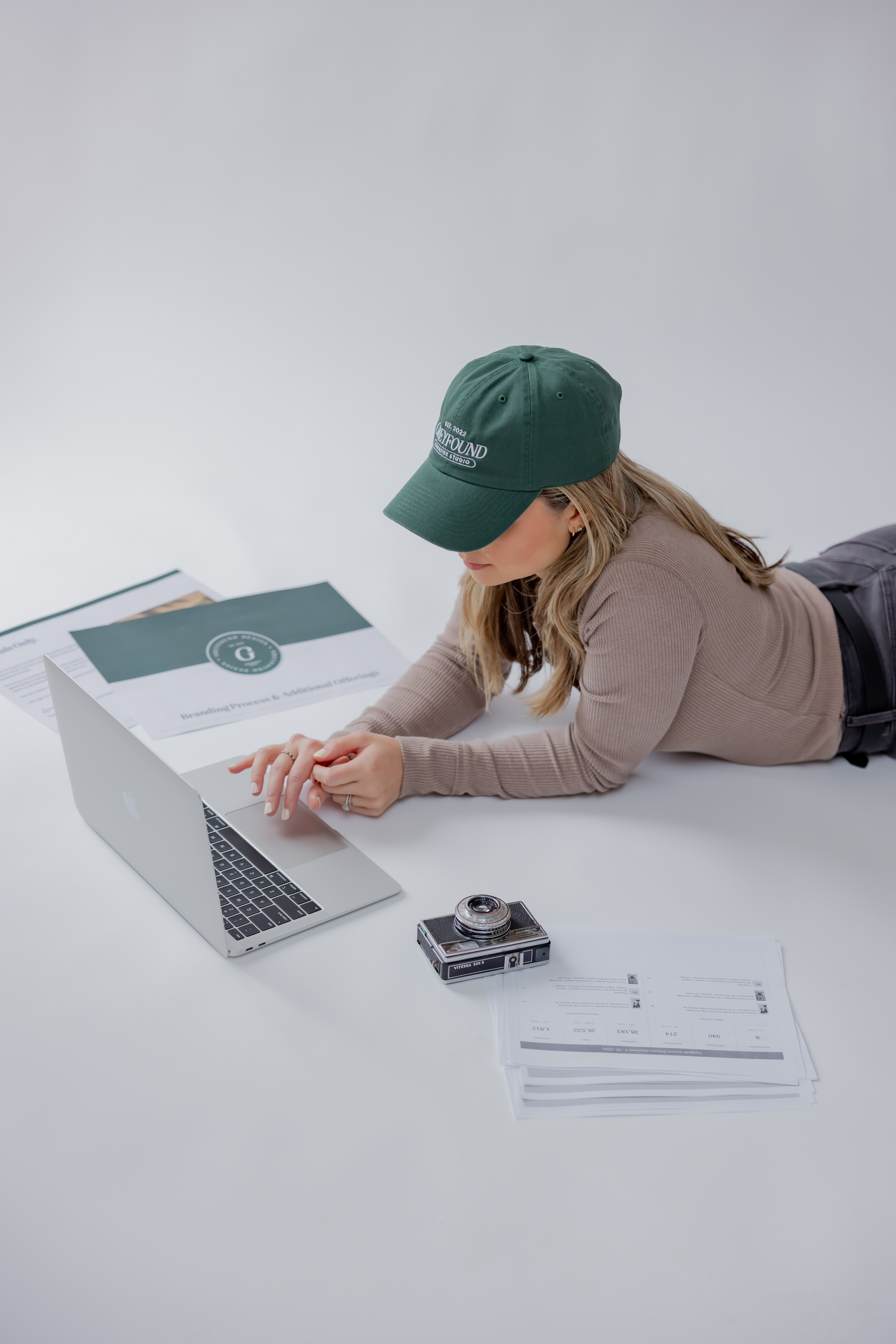
 Design with Purpose: Lora’s Role in Shaping the Ellafi Brand
At Ellafi, our mission to empower Women+ and those who support them runs deeper than products and services—it lives in every detail of our identity. This month, we’re shining a light on the creative force behind our brand transformation: Lora Cuff, founder of Greyfound. From the name Ellafi to the colors, typography, and even the meaningful details in our logo, Lora helped translate our values into a visual language that feels bold, beautiful, and unmistakably us. We sat down with Lora to reflect on the creative process, the story behind the brand, and what it meant to bring Ellafi to life.
Bringing Ellafi to Life:
A Look Inside the Rebrand with Lora Cuff of Greyfound
When Ellafi Federal Credit Union set out to redefine its identity, it was more than just a name change—it was a bold step toward aligning its brand with its values, especially its commitment to empowering women. At the heart of that transformation was Greyfound, a Connecticut-based creative studio founded by Lora Cuff.
I felt honored that they reached out to me. It was one of those projects that just felt different from the start. I was thrilled and really excited to work with them. My parents are Italian immigrants, and growing up, I saw them run their own small businesses. And I started my own design studio and understand the support and resources women need.
While Lora’s primary role was shaping the visual identity, she also contributed to the early naming process. The final name, Ellafi, emerged from a thoughtful and collaborative exploration that included Greyfound’s research and creative input.
“We created a document full of inspiring words and ideas, some rooted in history, others tied to femininity, trust, and community,” Lora explains. “Words like Ella stood out, especially for its connection to female empowerment and its accessibility across languages.”
With the name solidified, the Greyfound team immersed themselves in the brand’s foundation, reviewing Seasons’ extensive marketing research and distilling its essence into a new visual language.
“We created a mood board which is our first step in aligning visuals and messaging,” says Lora. “We come up with different typography and colors. Once the mood board is completed and the direction is approved, we're off to the design phase and presenting logo concepts.”
 Lora explained that Seasons really wanted the brand to tell a story and to evoke certain emotions and she thinks that was achieved. She enjoyed coming up with the colors and each one was intentional.
- Dark blue grounds the brand, conveying trustworthiness and professionalism
- Soft pink brings warmth and femininity
- Teal adds a sense of balance and tranquility.
- And the “a” in Ellafi features a stylized female face, complete with a bold coral lip—a subtle yet powerful symbol of confidence and individuality.
The coral lip is one of my favorite parts of the logo. It’s subtle but strong and intentional. It speaks volumes without needing to shout.
What made the experience even more rewarding for Lora was seeing Ellafi bring the brand to life across its physical branches. “They really embraced the branding—using the color palette in the interiors, matching the paint, staying consistent with typography. It makes such a difference.”
 It also marked a first: Ellafi was Greyfound’s debut financial institution client. “We’ve worked with many service-based businesses, healthcare providers, boutiques, restaurants, even recently a CT-based play café. But this was unique in that you can walk into a branch and feel the brand. That’s something I’ll always be proud of.”
Coming this fall, Ellafi will introduce a new initiative rooted in the same values of compassion, support, and community. Greyfound developed that branding too, and while details are still under wraps, one thing is clear: this creative partnership is just getting started.
Special thanks to Lora and Greyfound for bringing Ellafi to life. See more of their work at greyfound.com.
Headshots are by Abby Cole Photography

